Project 2 - Visualizing Women's values in Sweden and Japan 2010-2011
My interactive visualization can be found here. It is based on the pie charts that can be generated on d3pie.org, and has been modified to work with dynamic data. The data comes from the WVS Survey.
Jump to: First Analytical Trail
Jump to: Second Analytical Trail
Analytical Trail of WVS Survey Website
My idea was to compare how women in Sweden and Japan see their respective countries, since I might be moving to Japan for a year. I filtered on wave, countries and sex and choose the variable V10: Feeling of happiness. The results, aggregated as percentage per answer and country, were presented in a table like this:
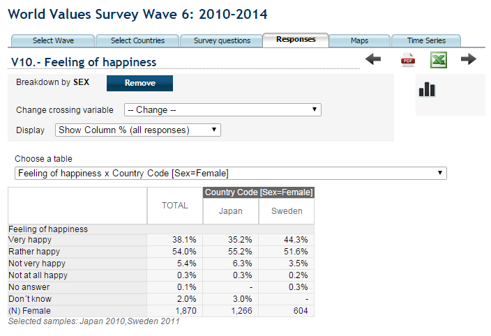
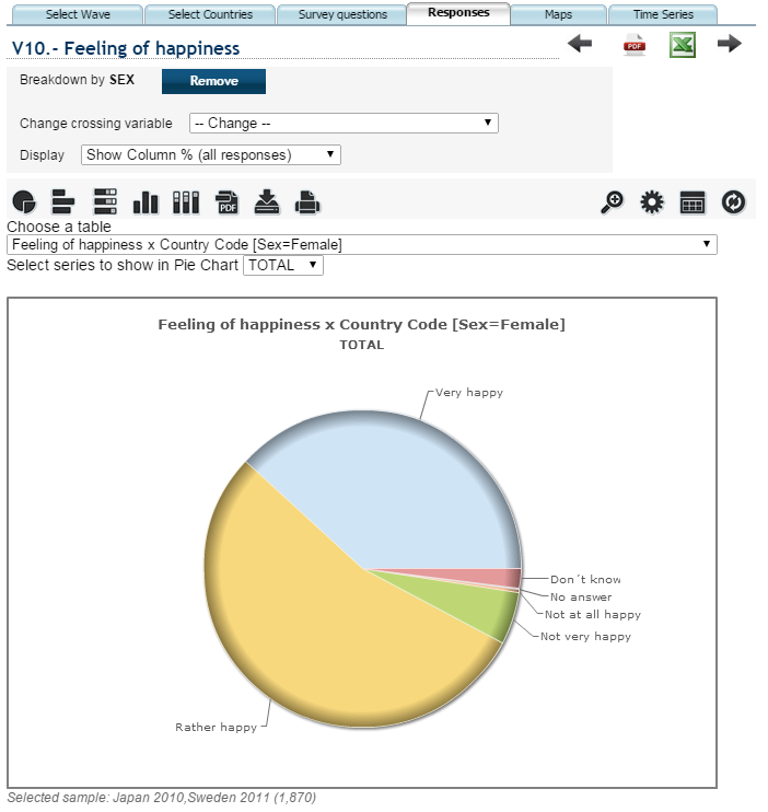
I could also choose the option to view the data as a pie chart with the percentages mapped to slices of the pie. It did however only allow me to see a calculated total percentage of the two countries or either country one at a time so it was hard to compare, and actual values were only shown by hovering over the slices with the mouse.
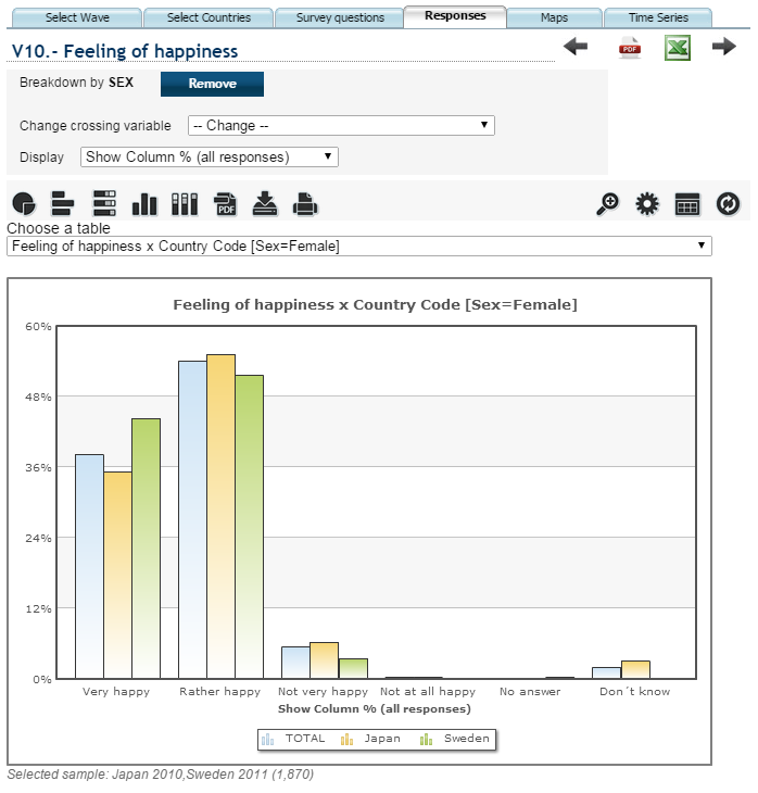
Showing the data as a bar chart with bars for every country and answer made comparison possible, but somewhat hard to quickly analyse and not optimal for showing percentages. Hovering over a bar showed the exact percentage. I came to the conclusion that women in Sweden seemed to consider themselves a little happier than women in Japan.
Analytical Trail of My Visualization
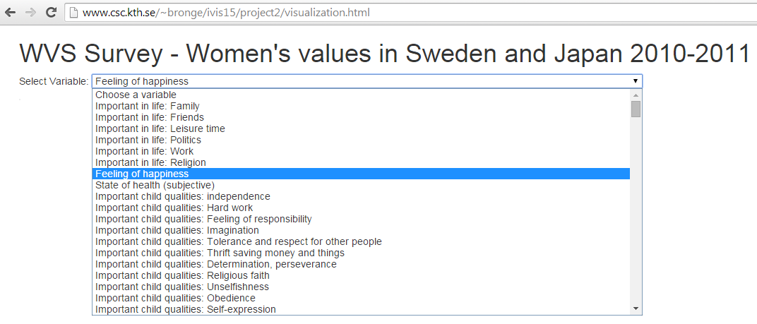
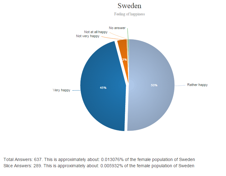
I wanted to show percentage with pie charts so that differences between the two countries could be easily distinguished. I downloaded a file with survey wave 6 answer data for every participant and question for Japan and Sweden, and saved as a csv file. For data cleaning I removed: all questions marked as not asked, all questions only asked in one of the two countries, some meta-questions, all answers which were not from women. Questions could be selected from a dropdown (did not succeed in making a search function) like this:
Percentage of answers are mapped to pie slices with number visible in the slices and answer option color coded for the two charts. Number of answers and info on how big part of the country's population they are are shown beneath the charts.

Clicking on a slice brings up the above info but slice specific:
My interactive visualization can be found here.