Lab 2 - Photoshop Techniques
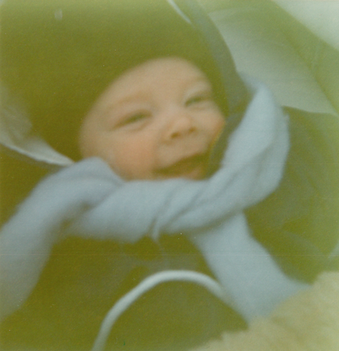
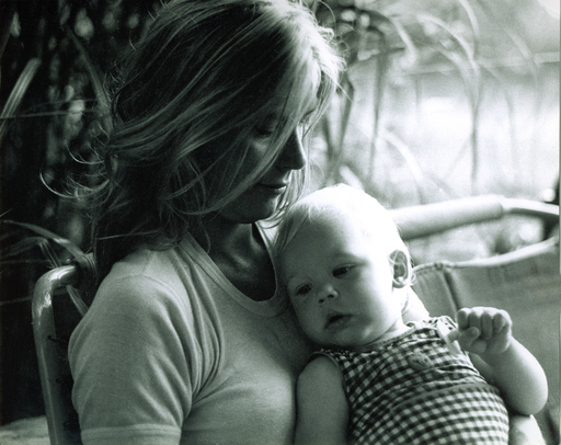
baby.png
This was a lot harder than it seemed! I spent quite some time adding different kinds of adjustment layers one at a time and checking out the different options, but the picture still didn't look especially good. So I tried mixing a few different ones. The one which I think produces an acceptable enough but still not awesome result was to first use Photo Filter, then Curves and last Color Balance to remove a little more of the yellow tone in the image. I decided that it was good enough for my first image restoration ever in Photoshop since I was pretty satisfied with the color of the baby's face, even though the edges of the picture were still a tad too yellow.
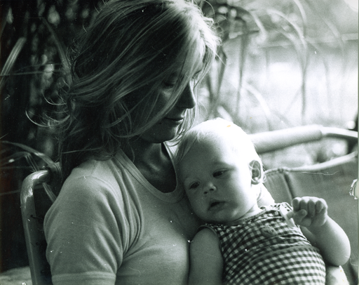
scratched.png
On this one, I almost only used the clone stamp to get rid of the scratches and small yellow patches that I found in the image. In addition to that I used the tool to select by color and sampled the red-ish color in the left of the picture, then created a adjustment hue/saturation layer out of that selection. Lowering the saturation to 0 and also increasing the darkness a little seemed to get rid of the red nicely.
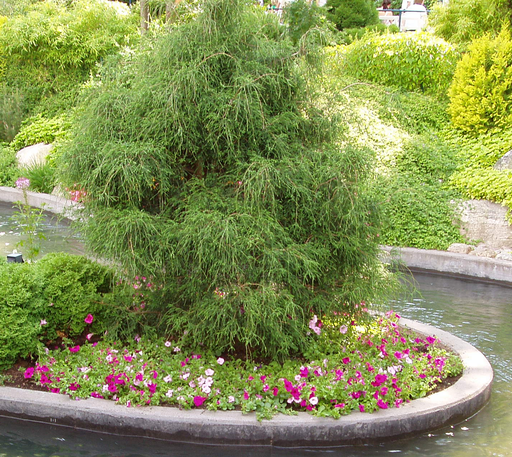
pink_flowers.png
The first problem I ran into here was that when I tried to add all the colors I wanted to replace, sampling the edges of the flowers resulted in also selecting a lot of other light details around the picture. I got around this by using the Quick Selection Tool around all the areas with actual flowers, and then creating a layer from that selection. Finally, I could replace the colors with a nice blue, and I think the result looks fairly good.

marsvin.png
I began by creating a curves adjustment layer and adjusting just the curve for red to get rid of a bit of the overly red color in the image. Then I created a color balance adjustment layer to tone down some of the yellow left in the picture. The image then looked better but kind of hazy, so I used another adjustment layer, levels, to get better contrast between the dark and light spots in the image. I think it turned out pretty well, but I'm no photographer so it probably is crappier than I think it is. The same probably goes for my idea of what a good composition is, but I decided that the arms to the left and the guy to the right weren't that important to this picture. Rather the focus should be on the child and the guinea he is presented with. I therefore cropped the image.


phat.png
I used the quick selection tool to select the areas I wanted to modify, which were the models stomach, his butt and the area between is chin and neck. Then I pushed them around with the liquify filter as suggested and cleaned up a little with the reconstruction tool. Afterwards, I used the clone stamp to fine tune some of the parts with trees since they looked a bit smudgy. I'm fairly happy with the result and think that if I didn't know I had photo shopped the picture, I wouldn't notice anything. So finally I was to try to improve the composition. Placing the model in the middle of the picture looked really weird so I decided to look up some suggestions for making good picture compositions. By doing so I found out about the rule of thirds, so I tried applying that when cropping the image. I also cropped away some unnecessary sky above the model. It ended up quite good I think!


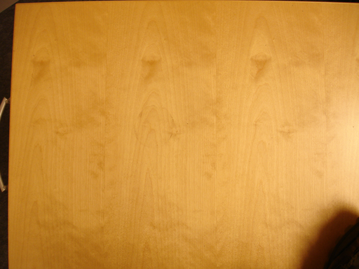
wood.png
The first problem with the image was that the perspective wasn't straight. So I searched google to see what could be done to correct this. I found a perspective cropping tool which I applied with great result. Next, I wanted to get rid of the shiny part on the right side of the picture, so I again searched google for tips. To fix this, I found that you could use Shadow/Highlights under Image > Adjustments. I set the tonal width pretty low since I only wanted to change the lightest part of the image. The result was a much more balanced image, although not entirely perfect. I added a Hue/Saturation adjustment layer to tone down the color a bit, which had become pretty yellow. I wanted it to be a little more wooden-like. Next step was to remove the coffee mug ring by using clone stamp. After that, I figured that one way to repeat the texture would be to mirror the sides, so I cut it in half and did just that. By doing so I also got rid of the black thing in the lower corner. Then I found another site explaining the use of a filter called offset, which moved the picture and wrapped it around the canvas. Then I just had to use a mix of the patching and healing tools to get rid of the very sharp edge. I also fine-tuned the light a bit with the dodge and burn tools. I would say that the result turned out OK, even though you can see that the texture is repeating itself because of color differences. At least there are no sharp edges. Having already spent a couple of hours fiddling around with all sorts of different tools and filters just on this image, I decided that the result had to be good enough.

And well, after having done all the photo shopping on these I noticed the links on the top of the page for the lab. That's what you get for not reading everything beforehand! At least I will get a chance to make use of them to create something even better when I'm going to do textures for my project.
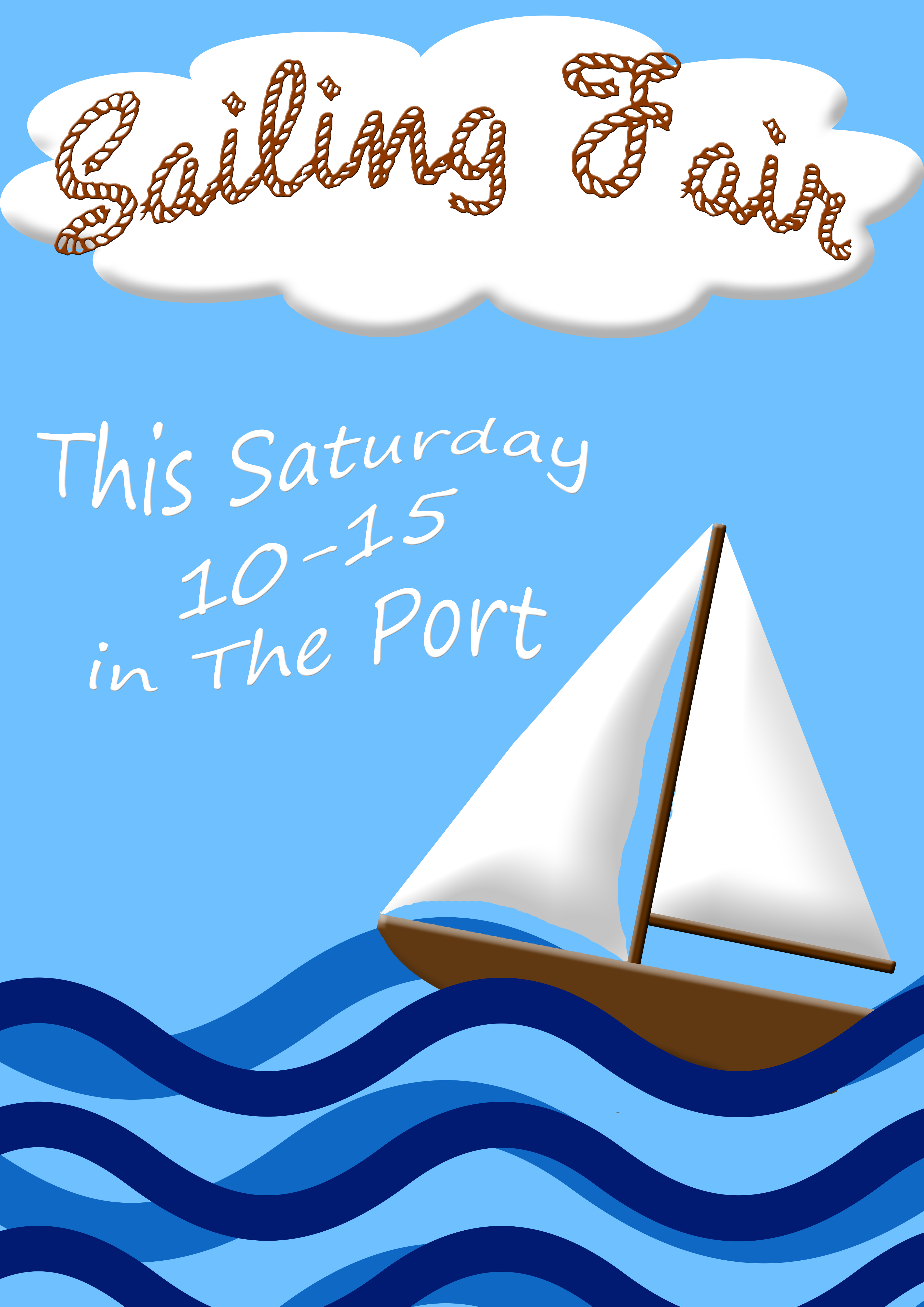
Poster
For the poster, I decided to do one announcing a sailing fair. I didn't want to clutter it too much so I decided to use text only for the title and the time and place. For the title, I downloaded a free font called Rope MF which I think helped the poster to show off a sailing theme. I made the rope brown with a cloud behind to make it more readable than against the sky. On the bottom, I put some wave forms with a sail boat to make the poster more interesting. The brown in the boat complements the brown rope text well. I haven't used that many different colors either, which I think might be good for printing? Anyhow, I'm actually pretty satisfied with this poster even though it's so simple because it's pleasant to look at and does a good job with conveying the theme and the message.